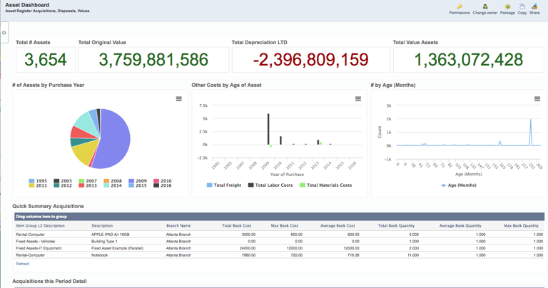
When it comes to providing information to your business in an easy-to-use format that everyone understands, dashboards are an excellent choice of delivery. But what makes a great dashboard? Here are five key things to remember based on our experience delivering dashboards to customers.
#1: Audience Matters
Dashboards work best when you target a specific type or group of users. Unless you are producing a board-level dashboard, don’t mix your data. All you’ll succeed in doing is cluttering up the space and minimizing the impact of the statistics that you want your audience to concentrate on.

#2: Decide What Type of Dashboard You or Your Users Need
Most BI specialists drop dashboards into three categories:
- Operational for monitoring in real time. Often these are the type of things that sit in the nerve center of the business, checking on logistics performance, inbound order statistics, etc.
- Strategic/Executive. KPI-centric and often based on longer time perspective data than operational dashboards
- Analytic. Dashboards built to improve understanding, and that act as spring boards for drill down and exploration, often with multiple layers
Oftentimes, you’ll be aggregating the same data for different groups. Even though it’s tempting to create one dashboard to satisfy every party, refrain from doing so. Like we discussed in Point 1, understanding the goals of your audience really needs to drive how data is displayed.
Let’s say your logistics center and your key managers want the same data, such as a listing of deliveries and pick ups. The logistics center will benefit more from an operational dashboard that auto-refreshes every few minutes so they can quickly assess what’s due next. At the same time, your key managers would find more use from seeing the same data in an analytic dashboard, so they can reflect on results rather than actions.
#3: Simplicity
If your metrics require complex legends and annotations to understand them, then they may well not be suited to dashboards. Simplicity is essential to making a dashboard user-friendly and used. Remember, it doesn’t have to show every metric you use to measure your organization, just the important ones that have a direct relevance to your audience.
#4: Time
When you create a dashboard you need to decide how frequently that data needs to change. The chances are that operational dashboards will probably need to be updated frequently, but this is not guaranteed. Sometimes seeing metrics change by the hour can simply be “noise” that doesn’t help anyone. Equally, your executive dashboard is likely to cover a longer time period and it’s unlikely that minute-by-minute changes will make a huge difference (but this isn’t a hard and fast rule). You need to consider the individual requirements and most importantly, you need to let the audience know what your data refresh and data time period actually covers.
#5: Visuals
 It sounds obvious doesn’t it: dashboards are visual things, but that doesn’t mean you have to use every single possible chart format that your software offers. Pie charts and bar charts with more than a dozen categories are generally very difficult to take meaning from, so if your data doesn’t summarize easily maybe you need a different format! Just because you can create a spark chart or plot a heat map or an area graph doesn’t mean your audience will understand them. Don’t be tempted to use every color under the sun, either. A restricted palette may well make more sense visually, particularly if you only use a couple of colors to highlight the very good and the very bad.
Lastly…
Remember, your dashboard doesn’t have to address every single thing on day one. There is a great deal of value in releasing something simple and relatively small at first and then modifying and adding until you have something that really helps its audience to focus on whatever the business message or overall goal that you are striving for. If your business has never really used visual metrics before then let your audience get used to the idea on a small scale before throwing everything at them (not literally!).


